Help Point Your Students In The Right Direction
Student happiness and engagement is linked to a school’s built environment.
School systems have it rough. Staff burnout, student safety, budget restrictions – you name it. As your school’s environment, curriculum and technology changes rapidly, your school building’s increases just as fast. While budget often constricts the amount of modernizations that schools can make to their facility, remodeling efforts can take months, years, decades or even not at all.
As you try to balance the safety of your students and faculty, you also have to consider their happiness. A school’s environment affects not only student happiness, but can also affect a students’ academic achievement. But what’s one way a school can promote safety and also refresh the look they’re in without drastic financial charges?
One answer... Signs
Signs help to create lasting first impressions by showcasing your school in innovative ways. By exhibiting your school values, helping to navigate students, faculty and parents around the premises, you’re also ensuring everyone is feeling safe both inside and outside.
- Signs serve several functions:
- Wayfinding (Directional)
- Health and Safety
- Who You Are
- Branding
- and more
On the flip side, there are also two types of benefits: function and design-led. For example, your school’s main entrance could say, “ENTRANCE” for the functional route OR it could say “WILDCAT PRIDE STARTS HERE” with your school’s mascot and bright school colors. The design of your visual solutions will determine the look and feel of your signs throughout the facility.
“WILDCAT PRIDE STARTS HERE” is a unique sign design with attention grabbing colors and images that turns into a statement showcasing your school’s brand. This can let the students, parents and staff know more about the type of school you manage, making them feel proud of where they study and work every day. Making classrooms and communal areas bright, colorful and inspiring makes a difference to student and faculty motivation helping them feel creative, energized and engaged. Scientifically, color is 1 of 6 design parameters in school systems that has a 25% impact on learning.
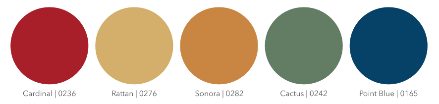
Here are 5 colors you can use for your signs that can enhance the learning environment in your facility recommended by Moorco:
RED: THE ENERGIZER
Red stimulates the adrenal glands and can generate feelings of energy and encourage creativity.
YELLOW: THE ATTENTION GRABBER
Yellow generates positive energy, encourages creativity and is the ultimate tool in capturing the attention of a restless classroom.
ORANGE: THE MOOD LIFTER
The color orange encourages critical thinking and memory. Studies have shown that it also has an especially high effect on circulation and the nervous system and increases the oxygen supply to the brain, stimulating mental activity while simultaneously loosening inhibitions.
GREEN: THE CALMING CONCENTRATION CATCHER
Green promotes calmness and a sense of relaxation and is great for encouraging long-term concentration. It is the most restful color for the eye and creates a feeling of ease when used in a classroom.
BLUE: THE PRODUCTIVITY DRIVER
The color blue has proved to have a calming effect on the heart rate and respiratory system of students. It encourages a sense of well-being, making it ideal for learning situations that are intensely challenging and cognitively taxing.
When trying to conduct where you can refresh your visual solutions throughout your school’s campus, we recommend comprehensive audits are best completed after a physical walkthrough of your site.
Walkthroughs help visualize where there might be signage elements missing. This is where you can examine buildings and rooms where you can either change, enhance or add signage. Any potential questions that staff, students or visitors may come across such as exits, evacuation doors or where classrooms are usually come up during this time.
3 things to keep in mind while conducting your walk-through:
Here are the 3 things to keep in mind while conducting your walk-through:
Identify
What do you want your signage to achieve? Is it to motivate and inspire students, impress visitors or keep staff and students safe? Where do you physically want your signage? Where do you physically need your signage?
Innovate
Think outside the box. Aside from your directional and safety signs, what messaging do you think would help to represent your school’s spirit? What are creative ways you can engage with the people inside using signage?
Consult
When working with a signage manufacturer directly, you receive not only superior customer service compared to working with a big-box store, but you receive their wealth of knowledge and expertise in the school signage industry. A manufacturer like Inpro can help your school decide on materials, design and help to make sure they adhere to ADA compliance.
With a walk-through, note your important signage elements such as wayfinding and health and safety solutions but also consider how the inside of your school has a wider variety of sign options such as campus maps, name plates, cafeteria signs, school spirit signs and more.
There are multiple bespoke ways to get your school’s values, branding and messaging across to all students, staff and visitors who come through your door.
Sign Material Options
At Inpro, schools can choose from a range of different design options for their school building’s signs. Not only can your school’s new signs be configured in one of our design presets created by our in-house design experts, but you can also choose between three different materials and even have custom images printed on your signs!
Palladium Rigid Vinyl - $
Material is one solid color throughout, making scratches less visible and has a velvet texture easy to clean. The letters, braille and design are individually applied to the sign, making it a two-piece construction available in one standard thickness.
Photopolymer - $$
This one piece construction sign has integral text and braille, adding reliability and vandal resistance. Give it a personal touch with paint, laminates or printed imagery.
Applied Acrylic - $$$
Starting with a non-glare clear material, solid color text is applied to the surface. Options for the face include paint and printed imagery.
Your school will not have to worry about hiring a designer that’s fluent in ADA compliancy either. Our team of signage experts are trained on the latest building and accessibility codes, helping to make sure you reduce liability and increase accessibility.